
HR Platform Redesign
Centralizing a fragmented HR experience into a single, navigable hub — so employees find what they need in 3 clicks or fewer.
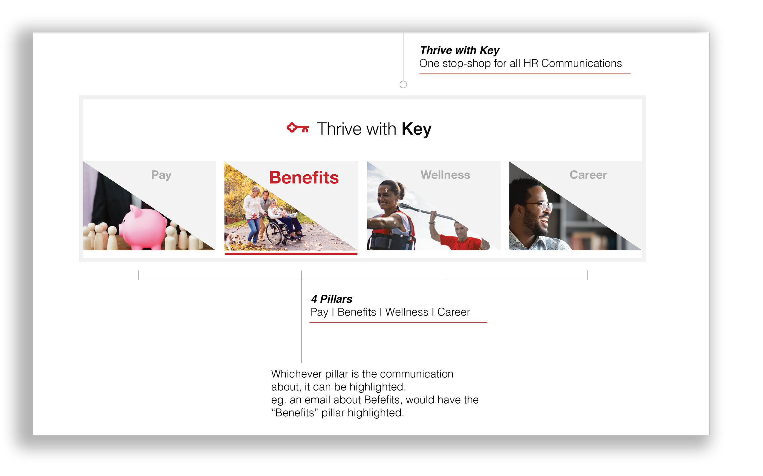
A company-wide HR rebrand at KeyBank surfaced a deeper problem: the existing platform wasn't built to communicate. Employees couldn't find critical resources. Managers had no single home. Policies lived in PDFs nobody read. The four-pillar HR brand — Pay, Benefits, Wellness, Career — needed more than a visual refresh. It needed infrastructure.
Research surfaced four recurring friction points that shaped every design decision that followed.
An overwhelming menu structure meant employees wasted time searching — or gave up and asked a colleague instead.
Resources for pay grades, training, and life events were scattered across the platform with no clear path to find them.
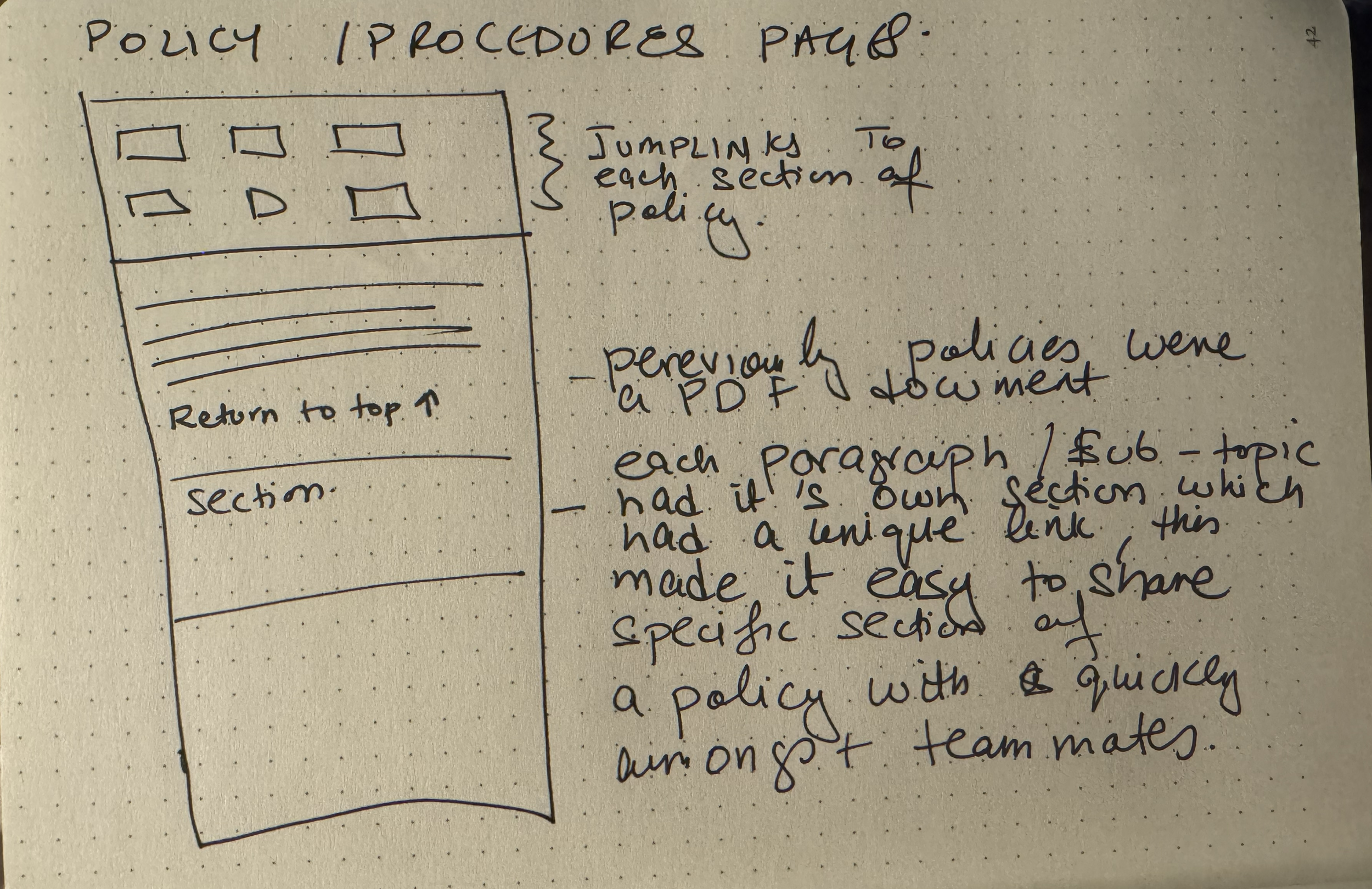
Long PDFs couldn't be searched, linked to, or shared selectively — creating compliance risk and daily friction for everyone.
Employees, managers, and new hires have different needs. The platform made no distinction between them.
Each pain point mapped to an explicit structural solution. No vague "better navigation" — every decision was tested against the 3-click standard and validated through three rounds of user feedback.
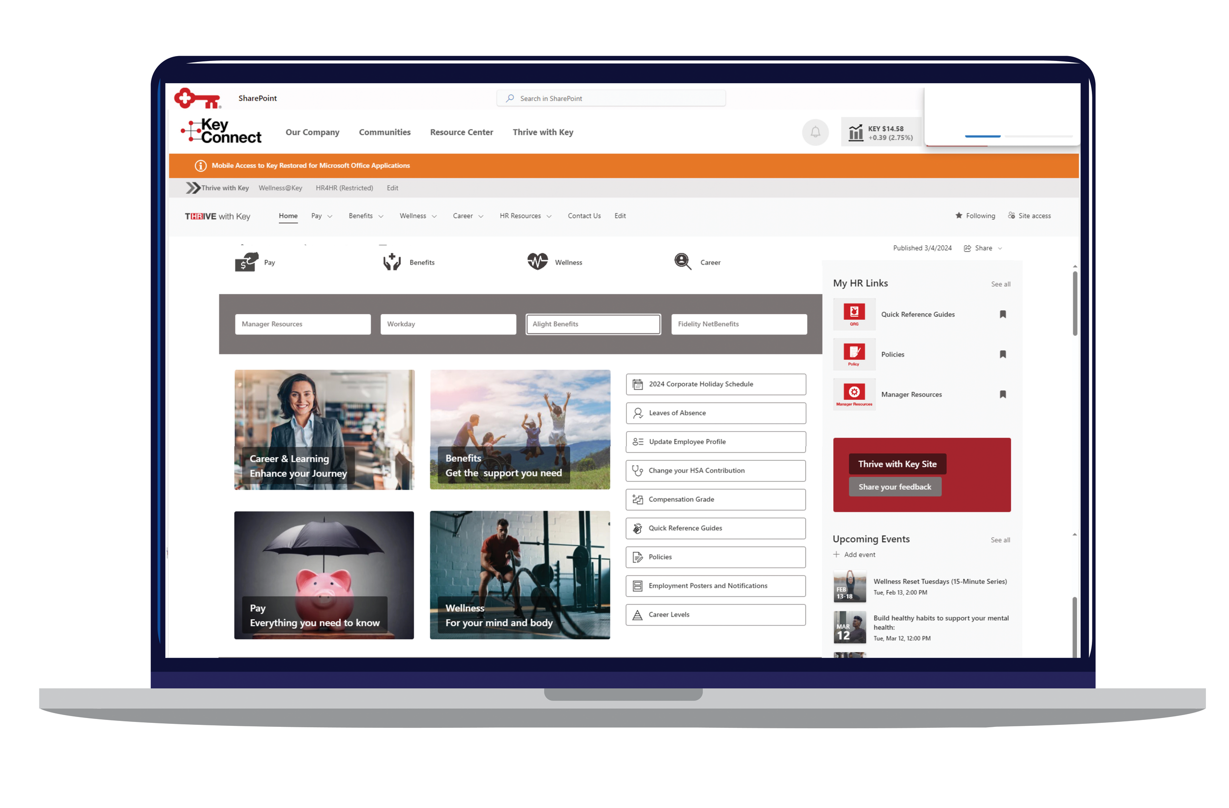
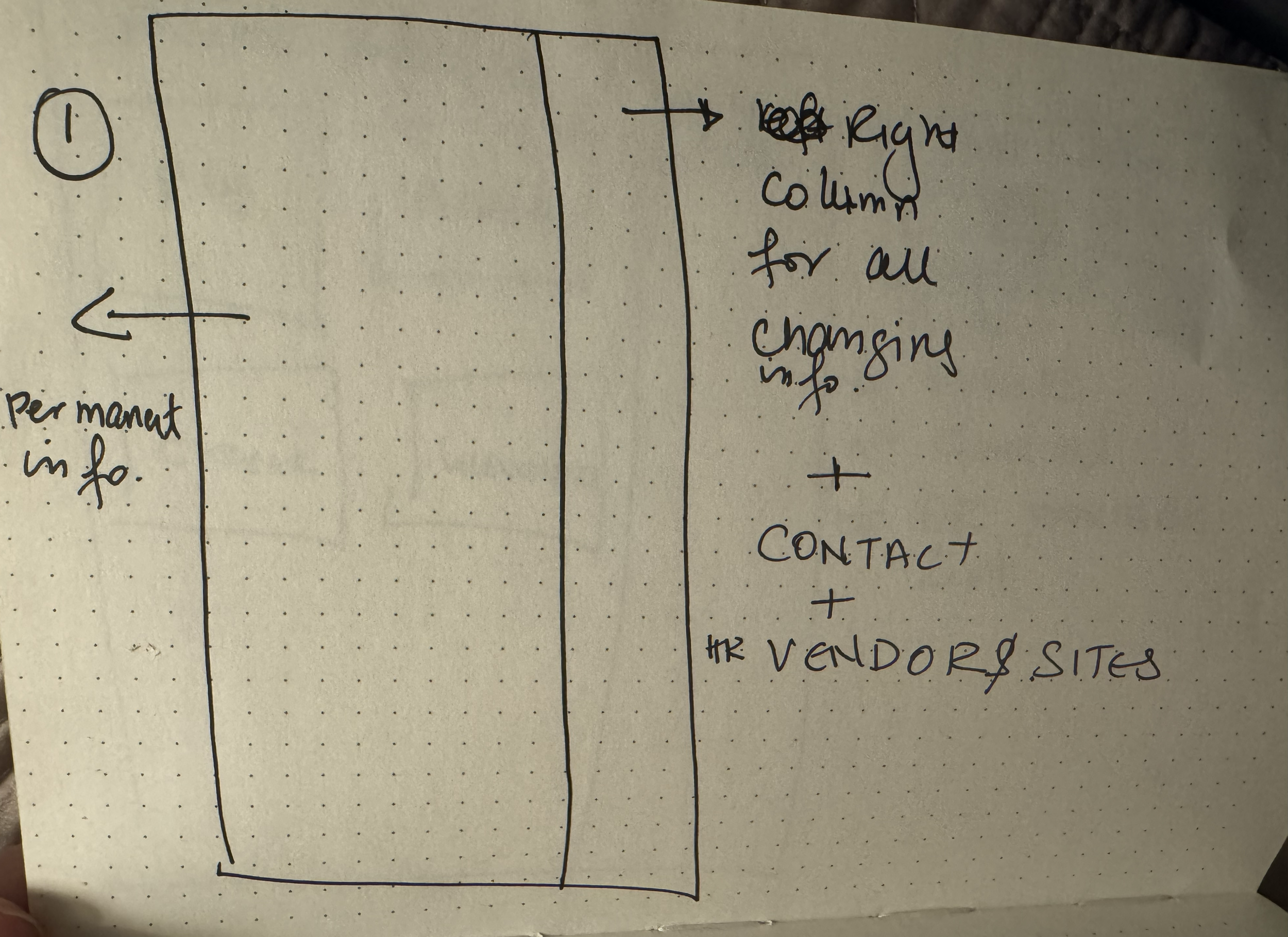
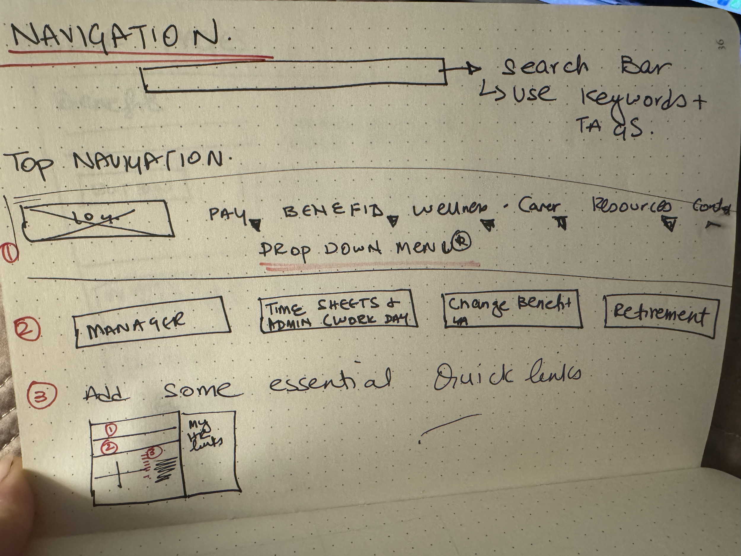
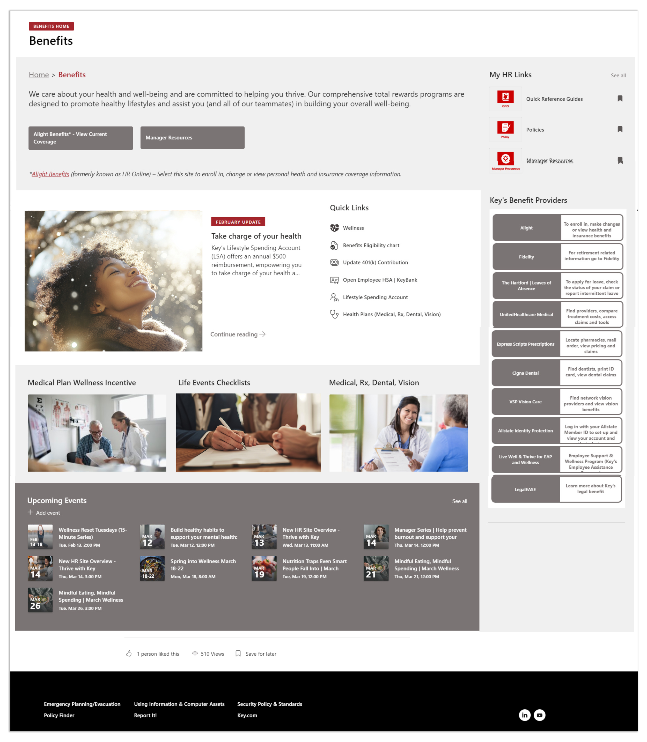
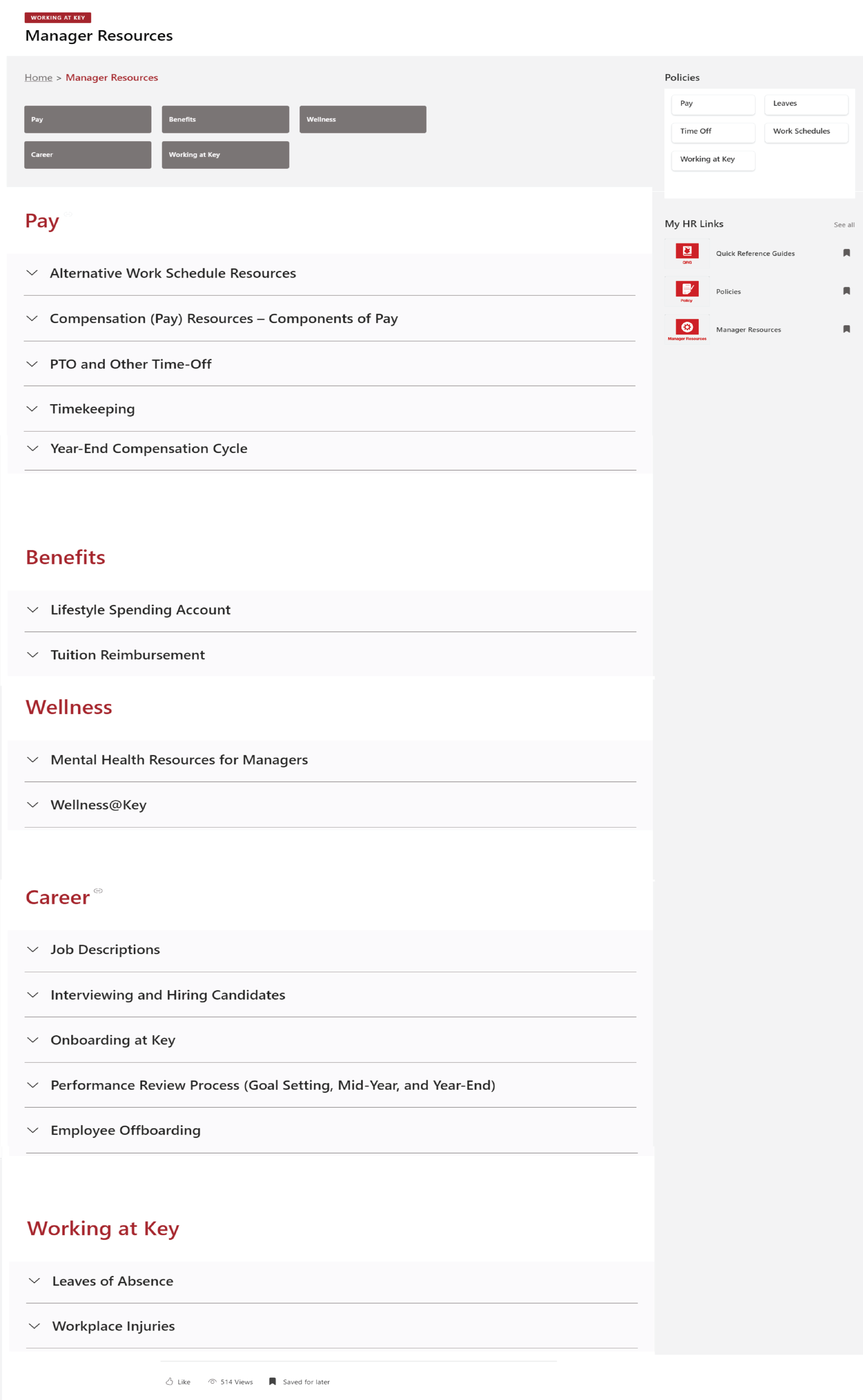
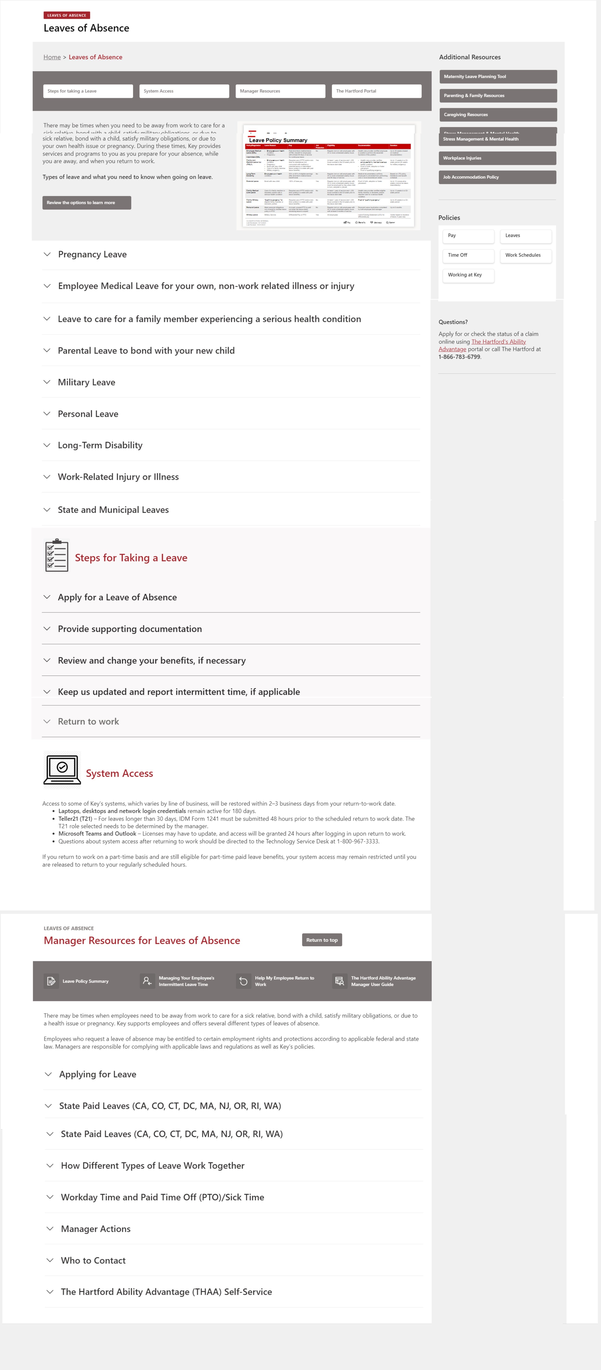
High-priority links live in the right column. Permanent resources anchor the left. Employees learn the layout once and rely on it every time.
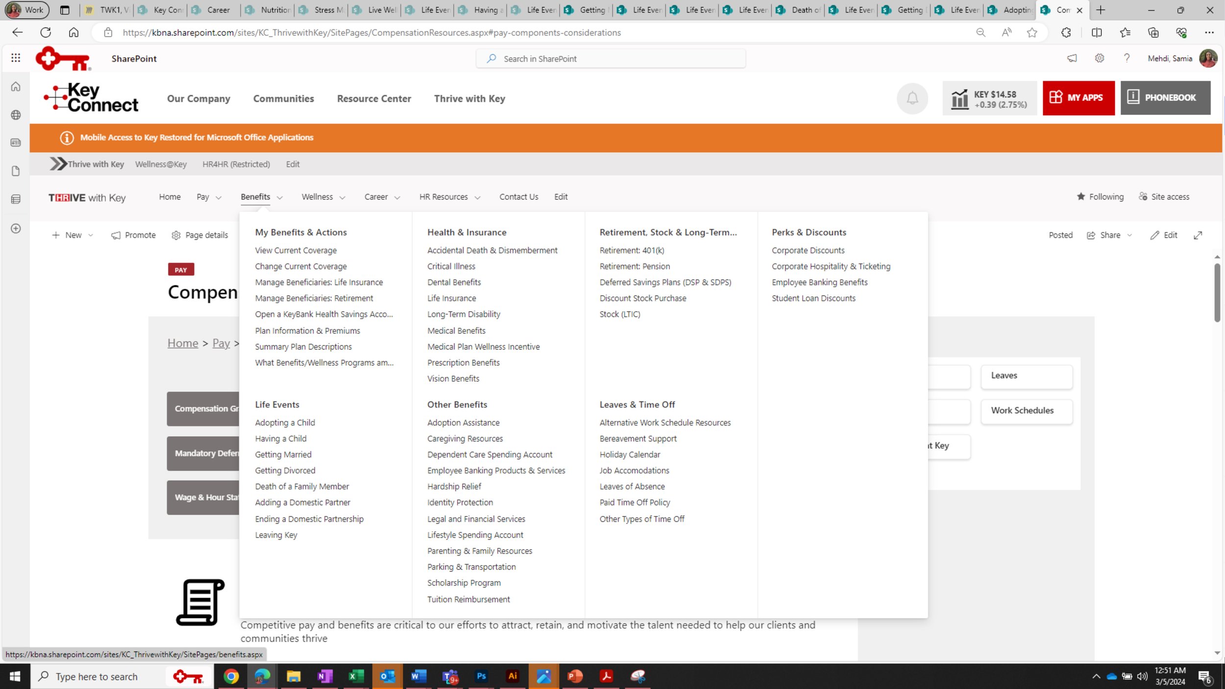
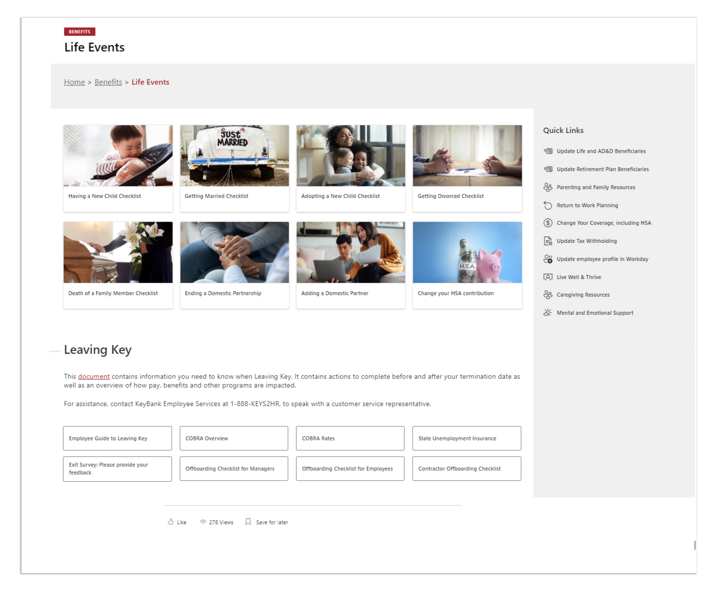
A mega-nav gives employees direct access to sub-sections without drilling through pages. Life Events, for example, is one click from anywhere.
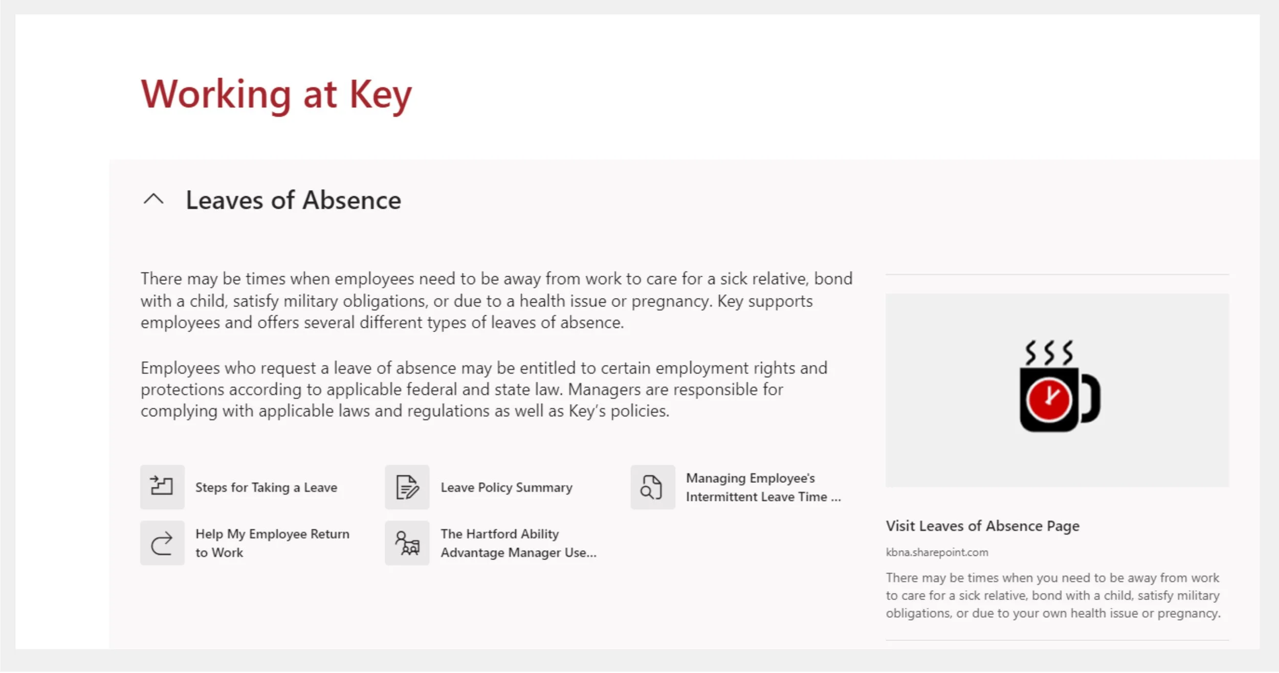
Policies moved from static files to interactive web pages with expandable sections, anchor links, and smart search. Shareable by section, not by document.
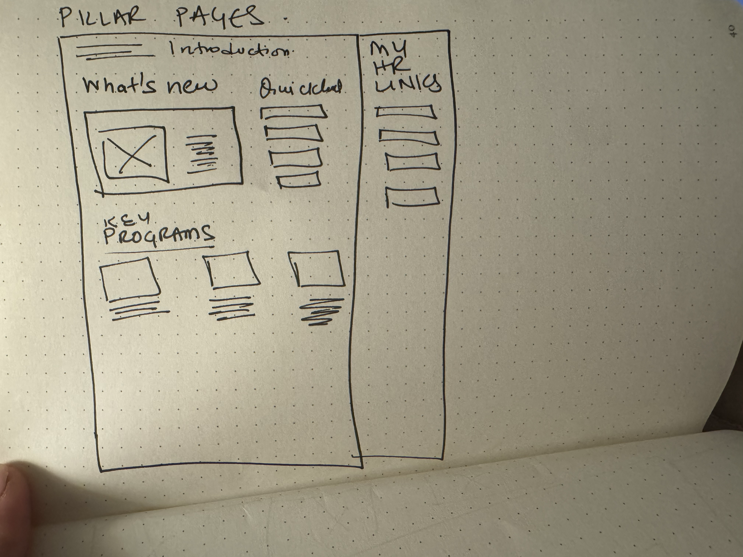
Each pillar page has a consistent three-zone structure: current updates on the left, quick links on the right, all associated programs below.
The live site organizes everything under Pay, Benefits, Wellness, and Career — mirroring the HR brand. Here are the key surfaces that solved the four pain points.
The most-used feature: a personal, editable list of favourite links that appears on every page load. Employees curate it once; it follows them everywhere on the platform.
Three rounds of user testing shaped this dropdown. It surfaces sub-sections — including Life Events and Manager Resources — without a single intermediate page click.
Benefits, Pay, Wellness, and Career each got a dedicated pillar page. Managers got something extra: a single hub pulling all four pillars into one view — every resource, no hunting required.
Leaves of Absence, parental leave, pay grades — each topic expands inline with quick links and full details. No PDF download. No page reload. No lost context.
Design is better when it's built together.
Working on a similar problem? Let's talk about it.